What has prompted each change? Changing fashions, wholesalers demands but a lot of the design decision was based on the technology that was available in printing labels at the time. It wasn't until our third label that labels became self adhesive.
Label One
1980- our first label we had for only one vintage. It was printed at the local printers hence only one colour as that's all they could do and they were hand labeled with shearer's glue. The logo was designed by Linda Tyrer, the owner of Galafrey.
Label Three
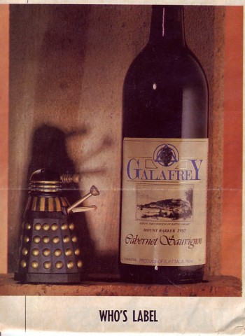
1984 This was a geographical change. Our vineyard operations were in Mount Barker but in 1984 we had moved our winery to Albany where there was a bigger population. Albany is a large country town with lots of tourists and Mount Barker, as a wine region back in 1984 was relevantly unknown. So the label used imagery and branding to reflect that move. The Albany logo with the ship, the Brig Amity, was the first ship to arrive in Albany. The picture was from a 1846 print, which the Battye Library kindly gave us permission to use.
Label Four
1992 Our 4th label was a photograph of our founder and winemaker Ian Tyrer. This was the first time you could have a photograph on a label. As most people knew Galafrey Wines as Ian Tyrer it seemed appropriate to have a distinct picture of him. This was our most controversial label as people either loved it or hated it. We had also moved the winery back to the Mount Barker property in 1992 but the cellar sales remained in Albany.
Label 5
1995 due to controversy we changed the label back to the traditional roots of the 3rd label removing the Albany imagery and focusing on our logo and distinct stripe. The lettering of Galafrey remained the same since the first label with a large G and Y bracketing the name.
Label 6
1998 very similar to label 5 but smaller, more refined and stylish- less bulky. This was the first change of our Galafrey lettering to reflect the fashion of wine labels at the time.
Label 7
2000 the stripe became a box around the logo within another box. The label focused on background texture, special effects in the varnish that reflected the light - the latest new thing in label printing. Also the shape-long and thin again reflecting the fashion of labels at the time.
Label 8 2005. once again simplifying and embossing the logo and print with raised ink.
Seems our labels are a history of print technology and fashion, as well as the changes in our business. Mainly my mother Linda Tyrer (and one of the last pioneers still working in the region) has be actively involved in the label design and I came in on the last two. We had the first label made at a graphic studio in Adelaide but quickly worked out with our background in design that we could do just as good of a job if not better because we sell the product as well and are in touch with the market. The changes haven't been related to winemaking but more printing technology, geographical locations and evolving trends in the industry.
This label is for the domestic market and export. We are not large enough to have more than one label. We have had some one-off label for small lines.


Comments